Connect your AI to
Linktree's design system
Production-ready Linktree components, installed with a single prompt. Works with Claude, Cursor, VS Code, and any MCP-enabled AI assistant.
One design language, everywhere
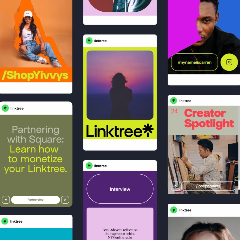
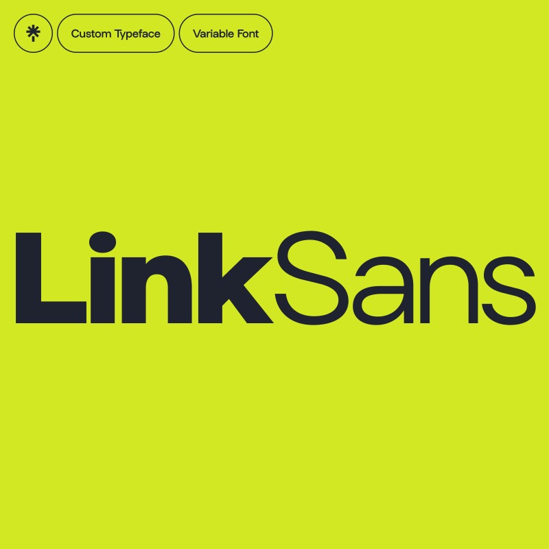
Arbor codifies Linktree's visual identity — from LinkSans typography to color and spacing — so every AI-built component stays on-brand

How it works
The Model Context Protocol gives your AI assistant direct access to Arbor's component library
Set up once
Drop a config file into your project. Your AI assistant picks it up automatically on startup.
Just ask
"Add the Button component" — your assistant fetches it from the registry and handles everything automatically.
Own your code
Components land as source files in your project. Customize freely — no lock-in, no runtime dependencies.
Get started
Up and running in under a minute with your favorite AI assistant
Create .mcp.json in your project root. Your AI assistant discovers it automatically.
{
  "mcpServers": {
    "shadcn": {
      "command": "npx",
      "args": ["-y", "shadcn@latest", "mcp"]
    }
  }
}@arbor namespaceAdd to your components.json to enable short install commands like @arbor/button.
{
  "registries": {
    "@arbor": "https://arbor-registry.vercel.app/r/{name}.json"
  }
}
Then install with: npx shadcn@latest add @arbor/button
With MCP enabled, your assistant browses the registry and installs components for you.
Why Arbor?
The design system that keeps every Linktree experience on-brand
Built for Linktree
The same components powering Linktree for millions of creators. Production-proven and battle-tested.
Familiar patterns
Built on shadcn/ui conventions. If you know shadcn, you already know Arbor — same patterns, instant familiarity.
AI-native workflow
Every component ships with rich metadata for AI assistants. Get accurate, on-brand implementations — not hallucinations.
Type-safe by default
Full TypeScript definitions paired with Tailwind CSS. Autocomplete that actually works, zero runtime surprises.
Components
Every component follows Linktree's design guidelines with full TypeScript support
@arbor/button
A flexible button component with multiple variants (primary, accent, secondary, outline, ghost, tran…
@arbor/icon-button
A circular icon-only button component with variants (primary, accent, secondary, outline, ghost, tra…
@arbor/radio-group
Accessible radio group component built on Radix UI with Arbor styling. Includes RadioGroup container…
@arbor/tabs
Accessible tabs component built on Radix UI with Arbor styling. Features active tab underline using …
@arbor/header-bar
Flexible header bar component with primary/secondary variants, responsive typography, tab integratio…
@arbor/actions
Flexible action toolbar component built on Radix Toolbar primitive. Provides ActionsButton and Actio…
@arbor/text
A comprehensive typography component with variant-based styling, automatic element mapping, and comp…
@arbor/cn
A utility function for merging Tailwind CSS classes with support for Arbor's custom design tokens. E…
@arbor/elevation
A utility component for applying Arbor's elevation shadows (levels 100-400) to elements. Supports as…